Doncha
A conceptual website design for a cozy bubble tea shop, showcasing brand identity, layout, and customer-focused aesthetics.
Project type: Individual
Tools used

HTML

CSS

Visual Studio Code
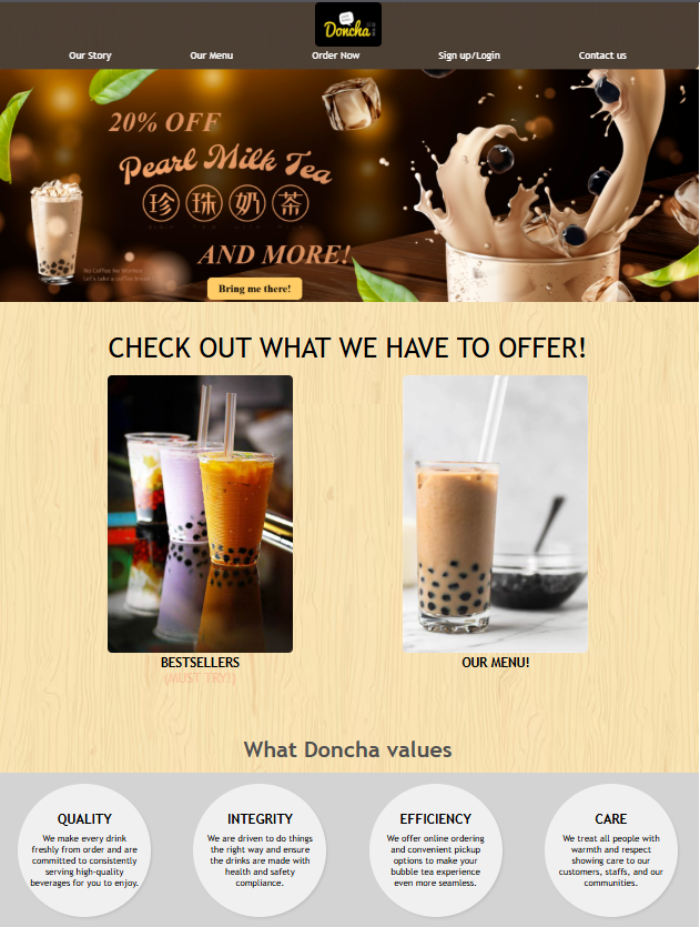
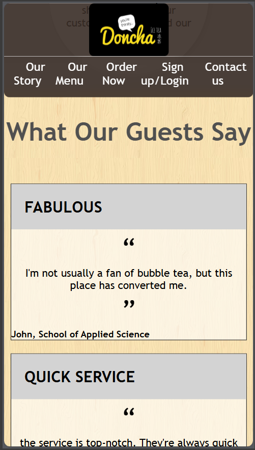
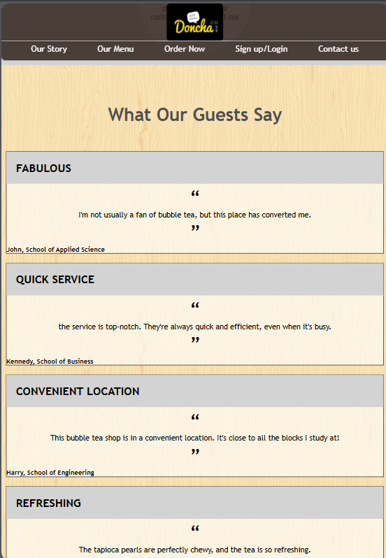
Homepage
This page is the first page customers will see when they enter the website. Customers can check out bestsellers, Doncha's values and social media challenges for giveaways.
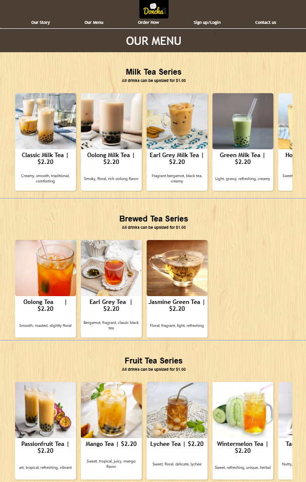
Our Menu
The page where all items offered are shown. The menu page is split into multiple sections, consisting of 'Ice Blend, Milk Tea, Brewed Tea, Brown Sugar Tea, Yoghurt Series and Smoothie series'. This clear differentiation highlights the wide variety of choices available, encouraging customers to explore different options and return in the future to try items that they have not tried.
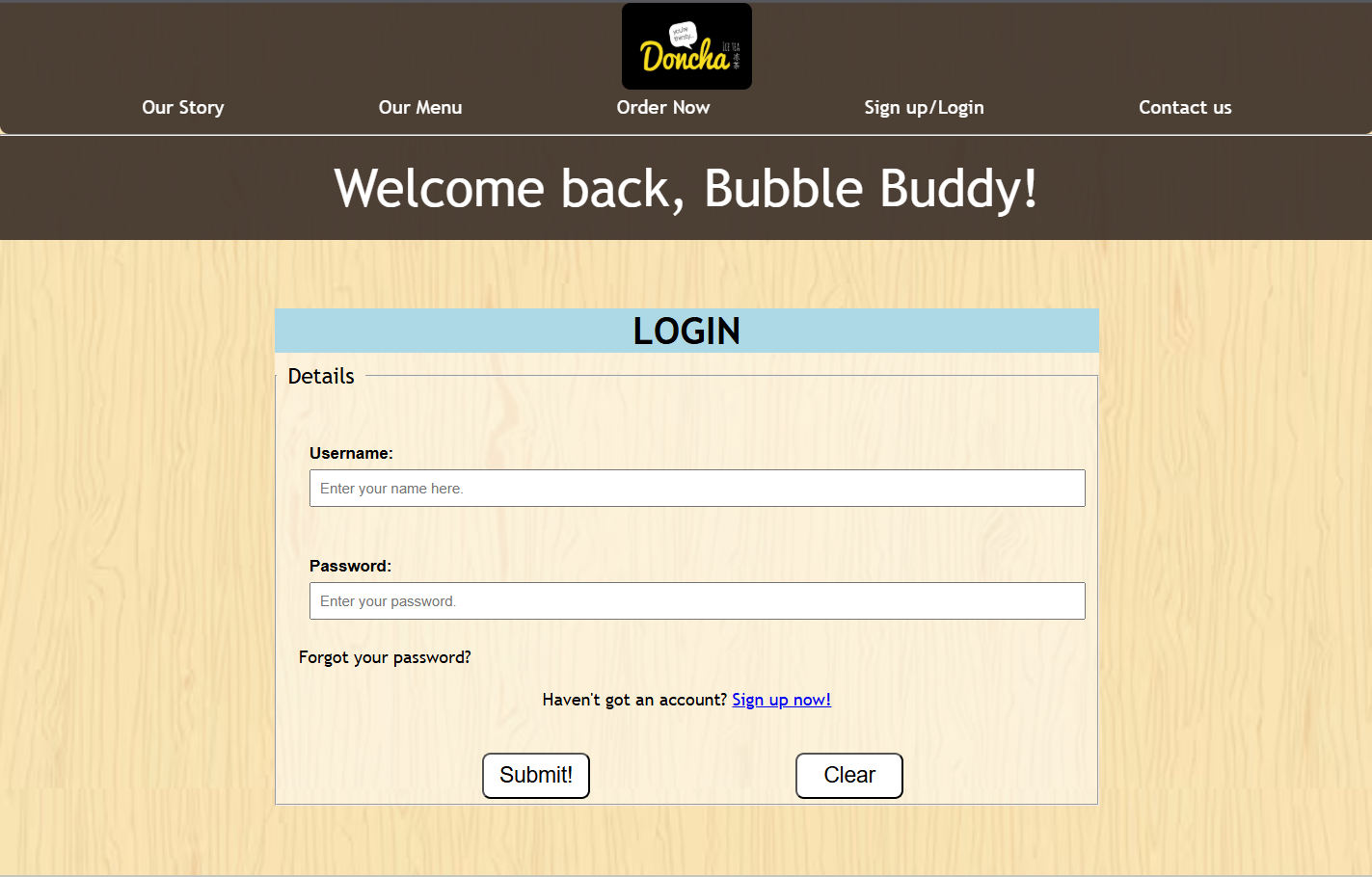
Sign up/login page for members
For returning members to login to their account, and for new members to sign up. Registered members can log in to access personalised features such as order history, exclusive promotions, and account management. This enhances customer engagement while ensuring secure handling of user data.
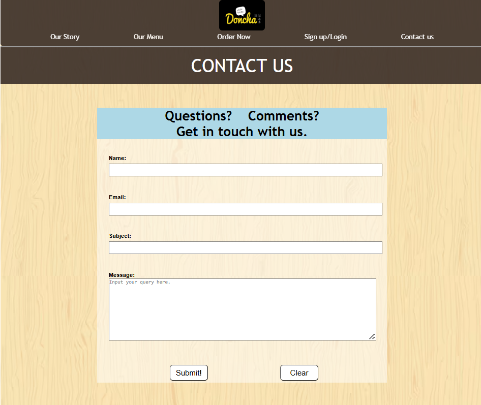
Contact Us page
This page provides users with a convenient way to reach the company for enquiries, feedback, or support. Customers can submit their questions through a contact form, ensuring clear communication between Doncha and its customers.
The Backbone
Beyond the visuals, the website relies on clean, efficient code. The following snippets show how I tackled challenges like [responsive design / dynamic content / form validation]
Scrolling menu
I implemented a scrolling menu using JavaScript to enhance user navigation. This went beyond the syllabus, but it was a fun challenge to code and experiment with. This small section taught me how to combine CSS layout techniques with JavaScript functionality, ensuring both usability and visual appeal across different browsers.
.flex{
margin: 0 auto;
display: flex;
gap: 20px;
width: 90%;
overflow-x: auto;
padding: 10px 0
scroll-snap-type: x mandatory;
}
.flex::-webkit-scrollbar
{
display: none;
}
Form Validation
I implemented form validation using HTML5 to ensure that all user inputs met specific conditions (e.g., required fields, correct format, and valid ranges). Through this task, I strengthened my skills in front-end logic, conditional programming, and client-side error handling, which are essential for creating reliable web applications in the future.
<div class="q">
<label>Password: </label>
<input name="password" type="password" required pattern=".{16,}" placeholder="Minimum 16 characters">
</div>
<div class="q">
<label>Reconfirm Password: </label>
<input name="password" type="password" required pattern=".{16,}" placeholder="Minimum 16 characters">
</div>
<div class="q">
<label>Home Address: </label>
<input name="address" type="address" required placeholder="Link your home address for deliveries.">
</div>
Grid Design
To create an eye-catching design for the social media challenge, I had to carefully think about how the grid would be presented, ensuring that the layout was visually balanced and engaging. In the end, I felt this grid layout was simple but aesthetically pleasing. Through this, I learned and strengthened my skills in front-end layout design and aesthetic decision-making.
#grid{
display:grid;
grid-template-columns: repeat(6, 1fr);
grid-template-rows: repeat(2, 1fr);
margin:20px;
grid-gap:20px;
}
Media Query
To make the website visually appealing on mobile, media queries were used. Since the website was developed on localhost, the “Inspect” element was used to simulate the mobile view. Localhost enables us to simulate entering the website on different devices accurately. Media query is one of the most important aspects for website design, and through this, I gained knowledge on how to adapt to the screen sizes of different devices while making the website still look intact and attractive.
@media screen and (max-width:1030px){
.container{
flex-direction: column;
align-items: center;
}
#title{
text-align: center;
}
nav ul{
margin:0 10px;
text-align: center;
}
#rev{
flex-direction: column;
}
#drinks{
flex-direction: column;
align-items: center;
}
.e{
margin-top:70px;
}
#first, #second, #third{
width:80%;
height:auto;
}
.w p{
font-size: 500px;
}
.circle{
margin-top:20px;
}
#first_flex, #second_flex, #third_flex{
flex-direction: column;
}
#first_flex img, #second_flex img{
margin-left:40px;
}
}
Iphone
Ipad
Design inspiration
The brown and beige design of the website wasn't the design I originally had. At first, I took inspiration from the Black Tap Burgers website, which incorporated a black and white layout.
.png)
However, the initial design felt plain and overly “PowerPoint-like.” After consulting friends and teachers, I decided to shift towards a warmer and more welcoming layout.
I realised that I have always been drawn to the atmosphere of cafés with warm colour tones. I often imagine walking into a café during winter, which gives me a strong sense of comfort and warmth.
This inspired the second design, which uses brown and beige tones. I felt this colour palette was suitable, as bubble tea comes in a variety of colours, and the warm, café-like vibe complements the store's overall aesthetic.
Final Thoughts
Lessons Learned and Insights Gained: Challenges, Skills, and Growth from This Project
Lessons learnt
-
- Working on this project individually meant I had to troubleshoot all code issues myself. It helped me develop patience and the habit of breaking problems into smaller, manageable parts.
-
- Because the website had many pages, I learned to manage my time by completing the pages with the most content first, and the simpler ones later, ensuring I finished the project on schedule.
-
- The project encouraged me to be creative. A website isn’t just code, it’s about capturing users’ attention and guiding them to explore the store. Learning to balance creativity with technical challenges helped me think critically about both design and functionality.
-
- Overall, I am very happy to be able to complete this project and produce a website that I am proud of.
Skills demonstrated
- Design Thinking: Applied structured design processes to create a visually appealing and cohesive shop concept.
- Coding Knowledge: Used VS Code, HTML, and CSS to build a functional digital mock-up of the shop website.
Technical Skills
-
- Time Management: Planned and completed all tasks, from research to presentation, within deadlines.
- Independent Research: Analyzed popular bubble tea websites, customer preferences, and design trends to make informed design decisions.
- Critical Thinking: Assessed design choices to ensure both functionality and aesthetic coherence; not too complicated but still advanced.
- Project Management: Oversaw all aspects of the project individually, from concept development to final presentation.